
Review only · nothing shipped
Logo concepts
The shortlisted production-capable vector directions, each shown in the identical comparison frame: large lockup on warm white, live header size, reversed on dark, icon at 64px and 24px, and flat monochrome black. All artwork is outlined paths — no live text, no raster, no blur. The current site logo, favicon, metadata and brand package are untouched.
Quiet Luxury
Geist SemiBold, lowercase, upright · generous letter gapa · Horizontal lockup

b · Header size (26px)
c · Reversed on dark

d · Icon 64px / 24px

e · Monochrome black


Review only · derived from Concept 1
Concept 1 refinements
Four controlled variants. Everything is held constant from Quiet Luxury — upright Geist “insurance”, bright orange #FF6A00, identical spacing, flat vector — except the single variable named on each card. Concept 1 itself is unchanged above.
Capital W
Capitalisation onlyLarge lockup

Header size (26px)
Reversed on dark

Icon 64px / 24px

Icon on dark 64px / 24px

Improves: the capital W gives the single word a clear reading break, so “insuranceWizard” parses instantly at header size. Tradeoff: slightly less of the seamless one-word quality of Concept 1.
Capital W + larger open center
Star centre at ~45% of radius (was ~30%)Large lockup

Header size (26px)
Reversed on dark

Icon 64px / 24px

Icon on dark 64px / 24px

Improves: the wider aperture makes the star read as a deliberate mark rather than a filled sparkle, and it holds shape at 24px because the arms were thickened to compensate. Tradeoff: the mark carries a little less optical weight beside the wordmark.
Capital W + centre fading to background
Geometry-following interior fade on 1B's open-star constructionLarge lockup

Header size (26px)
Reversed on dark

Icon 64px / 24px

Icon on dark 64px / 24px

Improves: starting from 1B's larger aperture, the inner edges of the four arms step down to the surface through concentric star-shaped bands, so the transition follows the four-point contours instead of sitting as a circular spot. The feather now starts farther out and the inner bands drop away more decisively, so the effect is legible at 24px and clearly visible at 64px and above while roughly the outer 55% of the visible band stays fully opaque and razor-sharp. Symmetric horizontally, vertically and diagonally. Tradeoff: the effect depends on the background showing through, and it is tuned for elegance rather than drama.
Reproduction note: Concept-only effect. Background-dependent transparency is unreliable in print, embroidery, vinyl and small favicons — a flat punched-centre fallback would be required for those.
Capital W + italic Wizard
9° forward slant on Wizard onlyLarge lockup

Header size (26px)
Reversed on dark

Icon 64px / 24px

Icon on dark 64px / 24px

Improves: the slant adds motion and separates the two halves without any colour trickery. Tradeoff: reintroduces diagonals — the only variant with a theoretical softness risk at 1x, though the flat fill keeps it crisp.
Review only · derived from 1C
1C edge refinements
Three keyline studies. 1C sits underneath each one completely unchanged — same solid bright orange star, same larger open centre, same geometry-following interior fade at the same strength — and the only addition is a single thin expanded-path contour. The wordmark is never outlined, nothing is hollow, and every contour is real outlined geometry rather than a CSS stroke, so the weight is fixed at every size. One tuning note: the briefed 0.65–0.95px weights were generated and reviewed first and measured visually heavy — at 24px the star's own arm tips are only about 1.2px wide, so a 0.75px contour swallowed the orange and started to read like the rejected hollow outline. Each keyline was therefore tuned to roughly half that weight, which is where it stays a true hairline at 24px and still reads at 64px and above. Original 1C above remains the control.
Graphite Micro-Keyline
Outer silhouette only · graphite on warm white, pale neutral at 55% on dark
≈0.40px optical at a 24px icon (tuned down from 0.75px)
Large lockup

Header size (26px)
Reversed on dark

Icon 64px / 24px

Icon on dark

Strongest of the three: one near-black hairline makes the filled orange star look cut rather than printed, and because it only traces the outer silhouette the interior fade stays untouched and the mark never doubles at 1x.
Tonal Orange Precision Edge
Outer perimeter + open-centre boundary · deeper orange #DD5A00
≈0.45px outer, ≈0.30px inner (tuned down from 0.85/0.60px)
Large lockup

Header size (26px)
Reversed on dark

Icon 64px / 24px

Icon on dark

Most self-contained — the definition lives entirely inside the orange family, so it survives on any background, but closing the open centre with a contour slightly argues with the fade that is meant to dissolve there.
Micro-Bevel Keyline
Pale-orange upper-left + deeper-orange lower-right hairlines, half-plane clipped
≈0.28px optical each (tuned down from 0.52px)
Large lockup

Header size (26px)
Reversed on dark

Icon 64px / 24px

Icon on dark

Reads as machined depth at 64px and above, but at 24px the two half-weight hairlines land inside the same pixel row and slightly muddy the top-left arm — usable, though K1 is the safer premium choice.
Monochrome: the black/mono lockups and icons for K1–K3 stay flat — a keyline in the same ink as the fill would be invisible, so single-colour reproduction falls back to 1C's flat mark.
Review only · background / application only
1C application study — Embossed environment
An environmental treatment, not a proposed master logo. The emboss is true same-material relief: an oversized 1C star — same outer geometry, same larger open centre — raised out of the surface it sits on, with a narrow highlight on the upper-left edge and a tight contact shadow on the lower-right. There is no orange in the embossed star, no chrome, gloss, glass, glow or broad drop shadow, and none of the old blurry letter-shadow treatment. Depth is built from three deterministic offset paths in the same colour family (≈3px at desktop scale), so nothing is blurred; the only filter on the page is the fine-grain surface noise, and it never touches the foreground. Both mockups use the identical composition and the current flat 1C lockup on top, unchanged.
Warm Ivory Emboss
Face #F3EDE4 · highlight #FFFDF8 upper-left · contact shadow #D6CCBD lower-right · ≈3px depth

Insurance made simple.
One place for every policy, document and renewal — with a licensed advisor behind it.
Edge detail · 1x

Edge detail · 2x perception
The safer of the two and the one that suits InsuranceWizard. Ivory keeps the page feeling like premium paper, the raised star reads clearly at a glancing angle without competing with the orange in the lockup, and black foreground type sits at full contrast over every part of it.
Graphite Emboss
Face #171717 · rim highlight #3A3A3A upper-left · contact shadow #050505 lower-right · ≈3px depth

Insurance made simple.
One place for every policy, document and renewal — with a licensed advisor behind it.
Edge detail · 1x
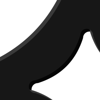
Edge detail · 2x perception
More dramatic and closer to the reference's soft-touch feel, but it costs the brand its warmth: on graphite the orange in the lockup becomes the only colour on the page and the emboss needs a stronger highlight to register at all, which is the first thing that starts to look effect-y.
Background / application only. The production logo assets remain flat vectors — no emboss is ever applied to the lockup, the icon, the favicon or anything in the brand package. This study only proposes how a page surface behind a flat logo could behave.
Modern Advisory
Inter SemiBold, Title Case, custom 4° slant (not an italic face)a · Horizontal lockup

b · Header size (26px)
c · Reversed on dark

d · Icon 64px / 24px

e · Monochrome black


Signature
Inter SemiBold, lowercase, 2° slant · single 0.5px shadow at 14%a · Horizontal lockup

b · Header size (26px)
c · Reversed on dark

d · Icon 64px / 24px

e · Monochrome black


Comparison
Rated 1–5. Higher is better.
| Criterion | 1. Quiet Luxury | 2. Modern Advisory | 5. Signature |
|---|---|---|---|
| Premium feel | 5 | 4 | 4 |
| Trust | 4 | 5 | 4 |
| Small-size clarity | 5 | 4 | 4 |
| Distinctiveness | 3 | 3 | 4 |
| Continuity with current brand | 4 | 3 | 5 |
| Total | 21 | 19 | 21 |
Recommendation
Concept 1 — Quiet Luxury is the strongest default. It removes the two things causing the current softness (the italic face and the shadow stack) without giving up any recognition: same lowercase word, same open-center star, same black-and-bright-orange pairing. It is the only surviving concept that is fully flat and fully upright, so it stays razor-sharp at 24px on every display, and it reads more premium than the current mark precisely because it is doing less. Concept 5 — Signature is the safest step if you want the change to be nearly invisible, and Concept 2 — Modern Advisory is the most institutional of the three. Concepts 2 and 5 are not reranked here.
Within the four Concept 1 refinements above, 1A is the strongest: the capital W buys instant readability at header size without adding a single new effect, so it keeps Quiet Luxury’s flat, fully-upright crispness intact. 1B is the best alternative if you want the star to feel more like a mark; 1C is beautiful but background-dependent; 1D reintroduces the diagonals we set out to remove.
Among the three 1C edge refinements, 1C-K1 — Graphite Micro-Keyline is the one to take forward for a premium insurance brand. A single near-black hairline is the most credible luxury device available: it reads as precision engineering rather than decoration, it gives the solid orange star a deliberate cut edge against warm white without touching the interior fade, and it is the only one of the three that adds no second orange and no second light direction, so nothing can go fuzzy at 24px. K2 is the fallback when the mark must sit on unpredictable backgrounds; K3 is the weakest here — the machined depth only pays off above 64px. Original 1C stays available as the control.
For the 1C application study, take A — Warm Ivory Emboss for the InsuranceWizard website. It keeps the warm-paper surface the brand already reads as premium on, the raised star stays a texture rather than a graphic so headlines and body copy never fight it, and black type holds full contrast across the whole panel. Graphite is the more theatrical of the two but it strips the warmth out of the palette and needs a heavier highlight before the relief registers, which is exactly where an emboss starts to look like an effect. Either way this is a background treatment only — the logo files stay flat.
Reply with “Concept 1”, “1A”, “1C”, and so on, and I’ll make it canonical: regenerate the full asset package, favicon, app icons, OG image and brand guide.
← Back to brand guidelines